

Візуальна айдентика Благодійної організації «Світло надії»
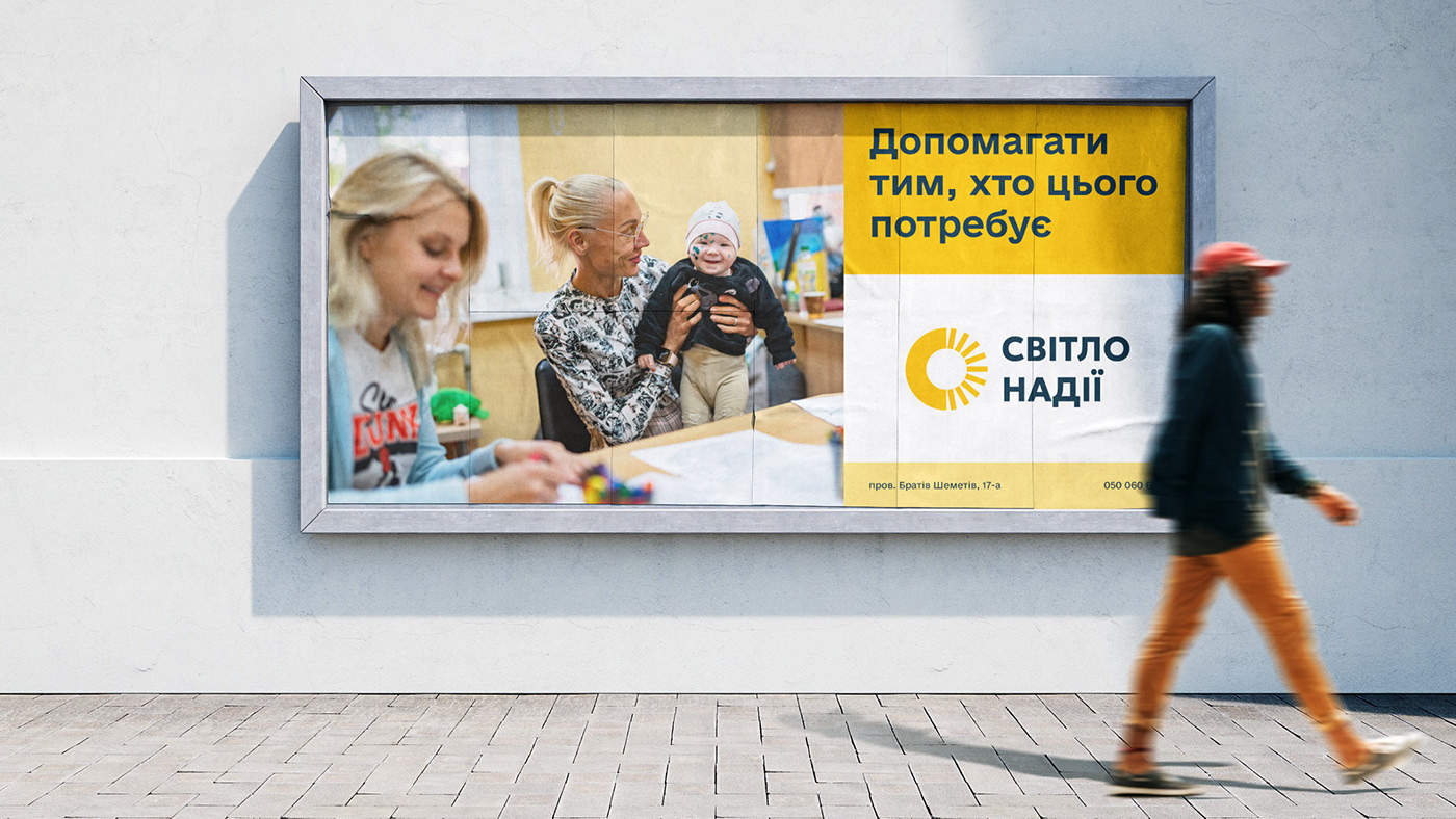
«Світло Надії» є однією з найбільших благодійних організацій у регіоні. БО надає широкий спектр послуг для людей які опинились у скрутних життєвих обставинах. Завданням для реалізації проєкту було створити цілісну візуальну систему. На момент постанови задачі вся наявна айдентика складалася із логотипа якому понад 20 років. Для клієнта було важливо створити систему, яка б відповідала нинішньому масштабу організації та системно працювала у всіх каналах комунікації. Через відсутність штатного дизайнера стиль мав бути доволі простим
у реалізації та масштабуванні.
Стосовно логотипа було прийнято рішення зберегти його солярну складову. Ватра кольорів підібрана щодо потреби «теплого» враження від візуальної комунікації зважаючи на чутливість тематики роботи організації.
Visual identity of the Light of Hope Charitable Organization
Light of Hope is one of the largest charitable organizations in the region. The organization provides a wide range of services to people in difficult circumstances. The task for the project was to create a coherent visual system. At the time of the task, the only existing identity consisted of a logo that was more than 20 years old. It was important for the client to create a system that would match the current size of the organization and work systematically across all communication channels. Due to the lack of an in-house designer, the style had to be fairly simple to implement and scale.
As for the logo, it was decided to keep the solar component. The color palette was chosen to create a "warm" impression of visual communication, given the sensitivity of the organization's work.


